Illustrations and iconography
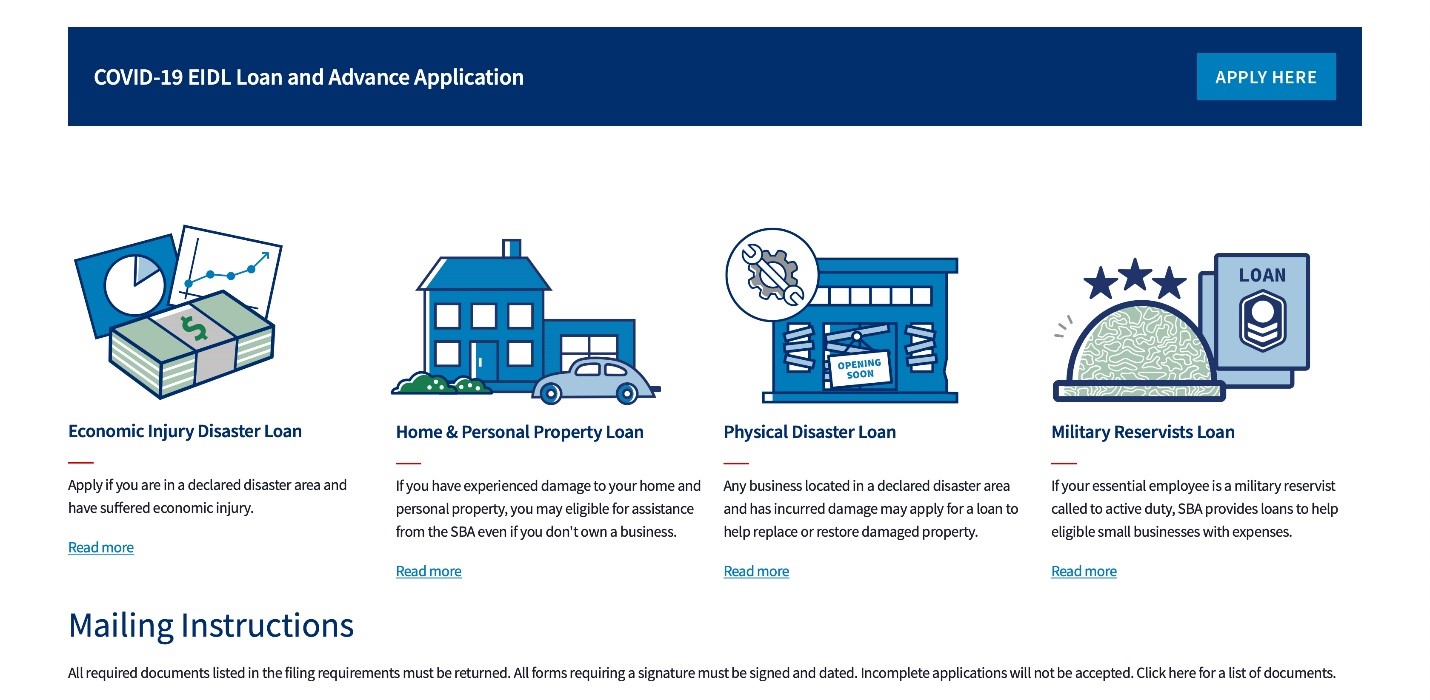
Illustrations and iconography are great tools to visually represent complex ideas. However, they require some thought and strategy when using them. Illustrations should not be used solely for decoration.
Our illustration and iconography style is clean, modern, playful but still professional, and a touch dynamic. It should work well on a white or very light gray background.
SBA staff and contractors can download illustrations and icons that SBA developed and approved.
Aesthetic guidelines
Perspective
Illustrations and icons should be portrayed from one perspective, either the front or the top, giving it a flat appearance.
Outlines and strokes
Strokes are 3pt in #002e6d (SBA Blue).

Fills
Fills are #007dbc (Secondary Blue).
Try to use as much white fills as possible unless the illustration becomes boring, then start filling with Secondary Blue to add interest.

Highlights
If an object is solid and filled in with Secondary Blue, leave a 3pt-ish white highlight along the left edge of it to convey a highlight.

Tertiary details
This includes glass effect, lines on paper, etc.
Use #c5c5c5 (SBA Gray Light) if SBA Blue and Secondary Blue are already in use.

Action lines
This includes blinging effects and movement lines.
Use 2pt in #002e6d (SBA Blue).
Use #007dbc (Secondary Blue) if it provides more visual balance to the overall image.

Style exceptions
SBA Red: #cc0000 (SBA Red) should be reserved for website “call-to-action” CTA buttons on SBA.gov, the red stripes on the American Flag, and illustrations or iconography that feature hearts or alerts.

SBA Green: #197e4e (Secondary Green) and #a8c4b1 (Secondary Tinted Green) should be reserved for objects that are naturally green, including trees and money.

Tints of Secondary Colors in Illustration and Iconography
Tints of secondary colors are permitted only in illustrations and iconography on SBA.gov to add depth and dimension. Color palette combinations should be used sparingly and must be color contrast accessible. Primary colors should be predominant.
Tints:
Hex #a5c6e0
Hex #a8c4b1
Hex #fbedb2
Hex #c5c4c4
Example of Tinted Secondary Colors within Illustrations
